Sick Pay Guarantee brand and user experience
Enhancing the Sick Pay Guarantee brand and user experience
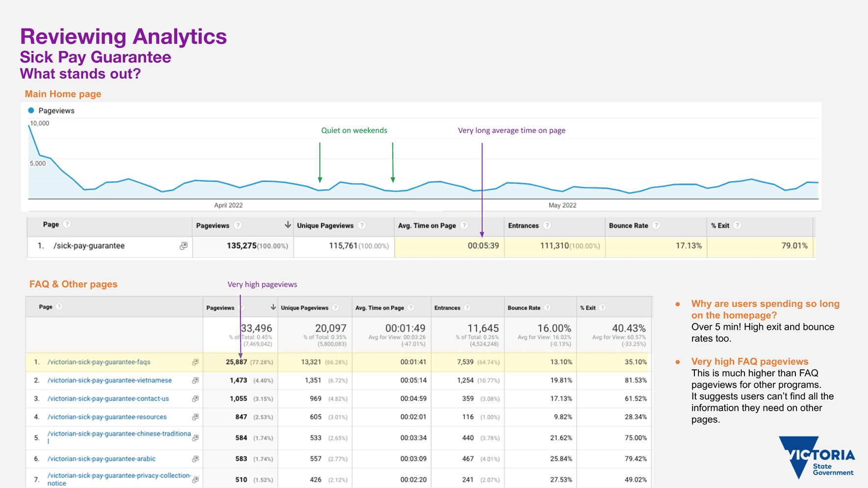
In May 2022, I undertook a review of user experience and analytics.
After reviewing Google Analytics, I noticed:
Users spend a very long average time on the home page.
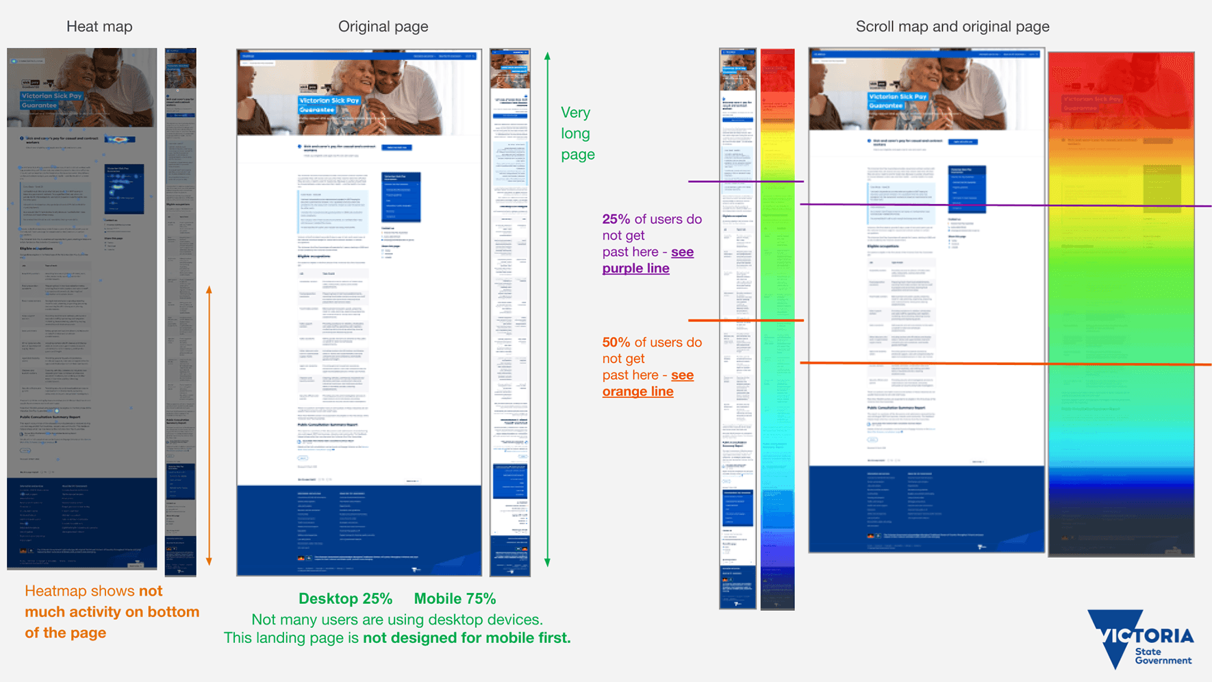
It was designed for desktop, but 75% of the audience was on mobile, with only 25% on desktop.
Looking at the Hotjar App, I saw:
Most users were not scrolling to the end of the page, missing important information.
25% of users do not get past here – see purple line
50% of users do not get past here – see orange lineUsers got stuck at the top of the home page. This suggests the audience is unsure about what to do next, and the page's lack of information on eligibility requirements made it confusing for users.
Looking at Google Search, I noticed:
The FAQ page was the second most popular page in search and the page had more FAQ questions than any other similar program. So users were confused about the program.
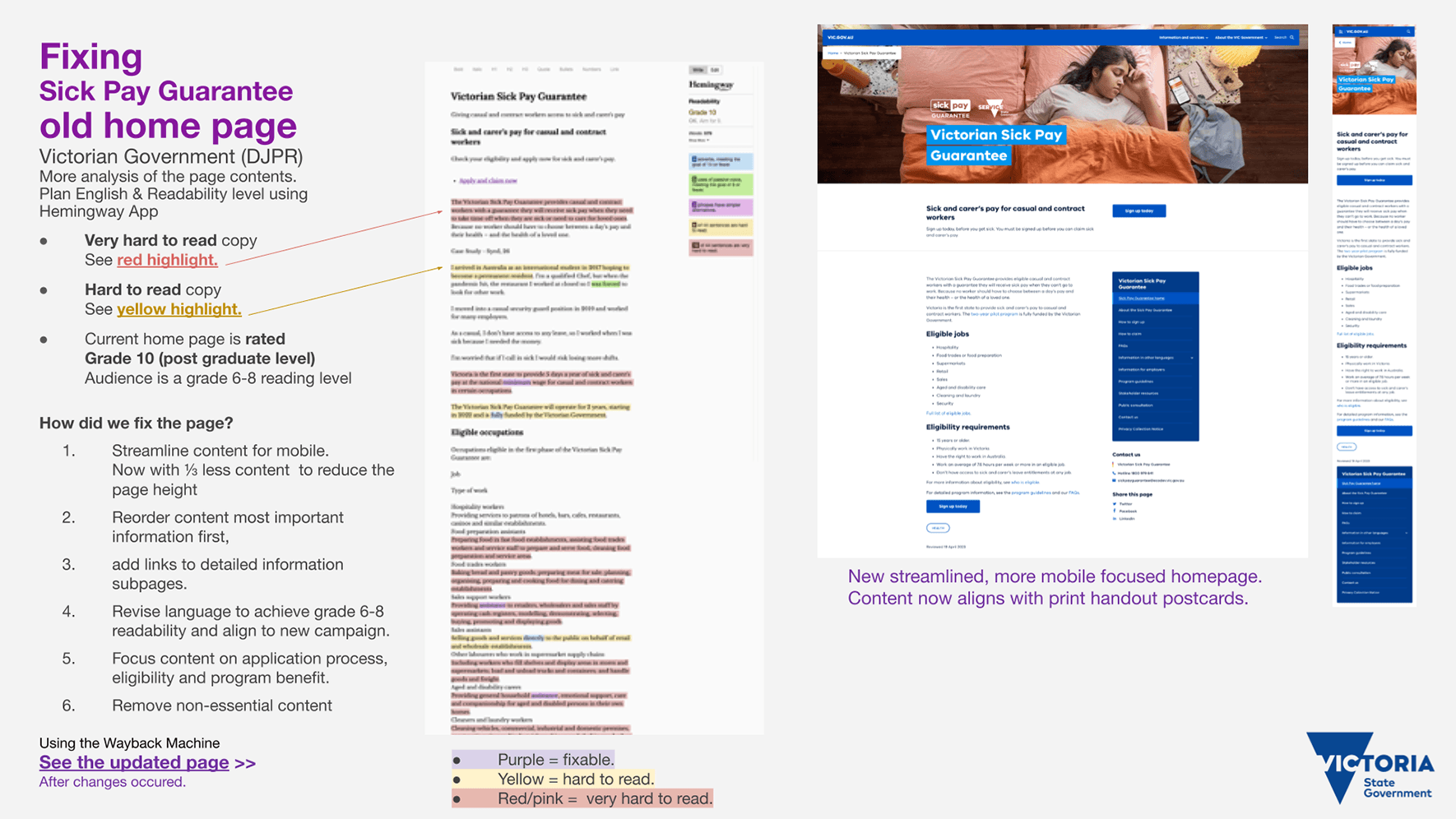
Checking ‘Plain English’ and Readability Level with the Hemingway App I saw:
The homepage was written at Grade 10 level (postgraduate), but the audience reads at a Grade 6-8 level, so the content doesn't match their reading skills.
Very hard to read copy see red highlight.
Hard to read copy see yellow highlight.
The website didn’t match the print artwork or style guide for the Sick Pay Guarantee. We didn’t look very professional or part of the same program.
How did I fix the problems?
I streamlined the homepage content with mobile in mind, reducing it by ⅓. Removed all non-essential content. Reordered the content with key information first, concentrating on who the program is for, eligible jobs and other eligibility requirements
Add a stronger messaging and Call To Action button directing users to the Service Victoria website to sign up to the program
Revised language on all pages to achieve grade 6-8 readability.
Working with the Comms Team, we looked at Hotjar user heatmaps of the most popular questions on FAQ page. We created new How-to sign up and How-to claim pages. I sourced helpful photos, eg a sample driver's licence, passport, etc. I linked to these pages from the revised homepage.
I created a new SPG website theme for all web pages that aligned with the print artwork. I also added the “girl in bed with orange doona cover” TV ad campaign image to the homepage, so we had a consistent look.
I created many webpage mock-ups and tested out different ideas. Working at SPG booth at the Missumma Festival, I noticed we lacked a useful print guide for eligible jobs. Working with the Community Engagement team, we came up with a Jobs A3 Poster areas and eligible jobs. To improve the web user experience for “phase 2” expansion of the program, we could do something similar to the jobs poster, by adding “group headings” and place similar jobs together. I had a bigger plan for the print material so it would match the revised web page, but I could not get this approved by the directors.
See program homepage >>
Before changes were made to the landing page
See the updated program homepage >>
After the changes were made to the landing page.
See new How-to-sign-up and How-to-claim pages.
New Graphic Design outputs while improving the SPG brand
1. Program Guidelines booklet. Content updates and improved the usability of the document.
2. Social media tiles phase 1 and phase 2 for many stakeholders.
Animated GIF on the resources page, see below.
3. Creating mock-ups & trying out different graphic design ideas.
5. Fixing colour problems (wrong colour profiles)
6. Improve the branding & accessibility. I got rid of the SPG orange colour in our print work after I discovered it doesn’t pass AA contest requirements.
7. Proofreading & testing QR codes and web links on postcards and handouts.
8. Improving internal assets (rework the staff PowerPoint template and fix the email signature).

Sick Pay Guarantee brand and user experience
Enhancing the Sick Pay Guarantee brand, website usability & content, and graphic design.


